📊 6 Charts Before You Buy
Run this visual scan before you invest
Welcome to the Free edition of How They Make Money.
Over 200,000 subscribers turn to us for business and investment insights.
In case you missed it:
A good chart beats a thousand words
That’s why, before I make any investment decision, I pull the same 6 charts.
This simple process helps me challenge my own assumptions and ground my decisions in data, not hype.
Here’s the cheat sheet to filter signal from noise.
At a glance:
📈 Revenue growth (fuel)
📊 Margin trends (durability)
🛡️ Debt & leverage (resilience)
🧩 Price vs. fundamentals (reality check)
💰 Valuation spectrum (expectations)
🧭 Peer comparison (context)
1. 📈 Revenue growth
Top-line growth shows where a company is in its lifecycle and what’s driving its momentum. It’s the fuel for the business.
What I look for:
Trend: Is Y/Y growth accelerating or slowing over the last 8–12 quarters?
Mix: Are the highest-margin segments growing the fastest?
Drivers: Is growth coming from more users (volume) or higher prices (ARPU)? Are there seasonal effects?
Quality: Is the growth organic, or is it from acquisitions (M&A)? Is it recurring or transactional?
Guidance: What is management’s outlook for the near-term and long-term?
The ideal pattern:
Acceleration or steady double-digit growth favoring high-margin segments through organic usage or price (as opposed to one-offs).
How I visualize it:
2-to-3 years of revenue with a Y/Y growth trendline by segment to easily identify the leading category and make any acceleration or deceleration pop.
Example — Amazon:
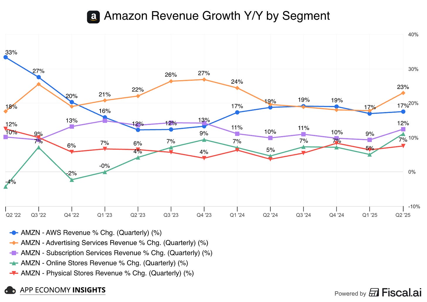
Trend: There's no slowdown. In fact, after a period of deceleration, core businesses like AWS have clearly rebounded and are now re-accelerating.
Callout: The high-margin engines, Advertising (+23% Y/Y) and AWS (+17% Y/Y), are the fastest-growing segments, driving the majority of the growth.
Highlight: This growth is entirely organic, a very positive signal.
Check out all of Amazon’s segments and KPI here.
2. 📊 Margin trends
Margins turn growth into cash. They reveal pricing power, cost discipline, and how well the model scales.
What I look for:
Gross margin: Direction over 8–12 quarters. What are the drivers (pricing, mix, input costs, infrastructure efficiency)?
Operating margin: Evidence that the engine scales without chasing costs (S&M/R&D/G&A as % of revenue drifting down).
Free-cash-flow (FCF) margin: Trailing 12-month (TTM) trend, cash conversion vs. net income, capex intensity.
Profitability mix: Are higher-margin segments gaining share, thereby lifting the company's overall margin profile?
The ideal pattern:
A steady operating-margin step-up. Gross margin can wiggle with the revenue mix, and that's not necessarily a red flag. A comfortable, rising FCF margin signals optionality.
How I visualize it:
A simple three-line panel (gross, operating, FCF margin) over the last 8–12 quarters. If seasonality is heavy, I prioritize an annual view.
Example — ServiceNow:
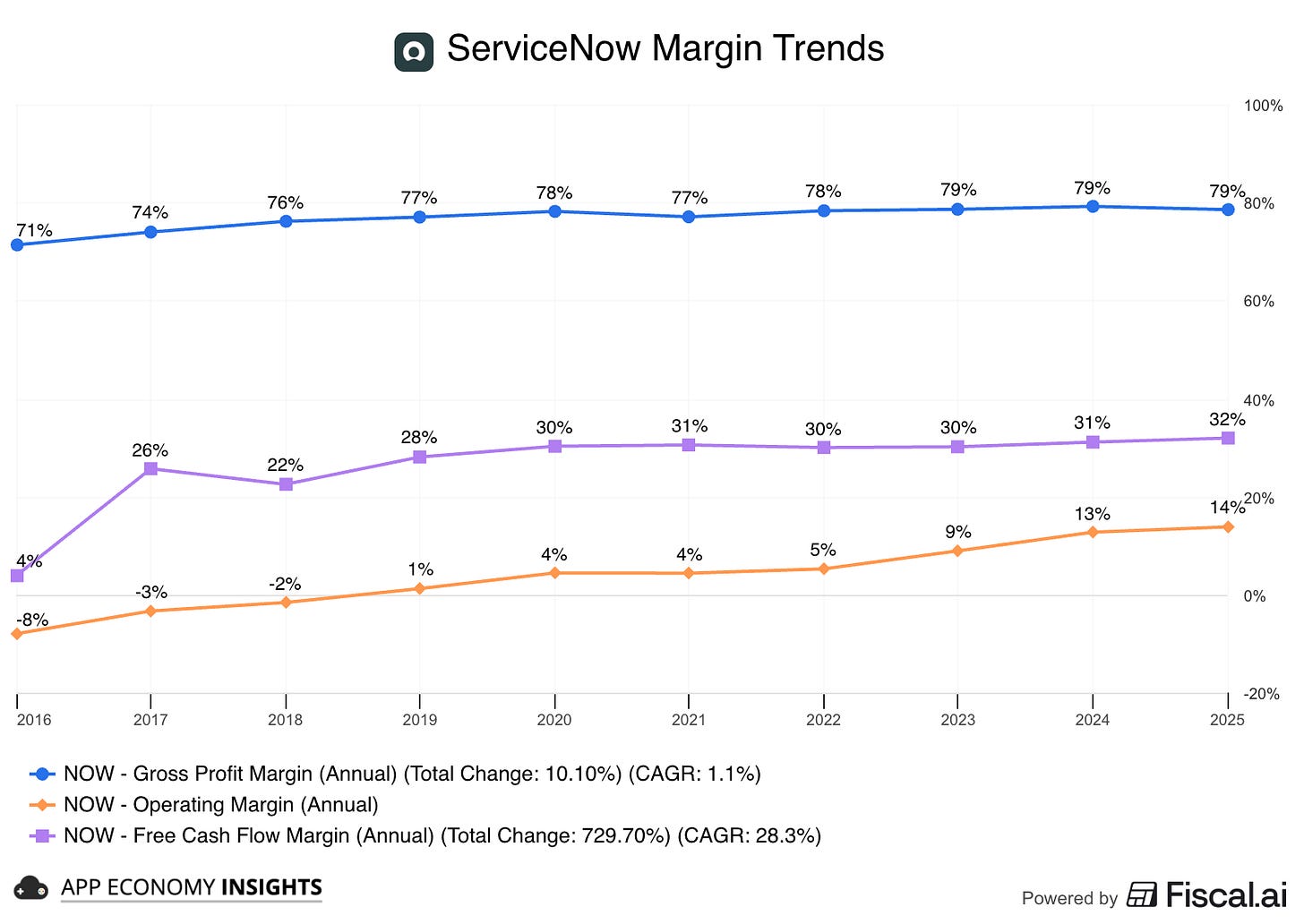
Trend: Gross margin has steadily expanded, and operating margin has improved even more over the past decade. The company's high FCF margin is heavily influenced by its use of stock-based compensation (SBC), a large non-cash expense.
Callout: The company's subscription model and scalable enterprise focus create clear operating leverage.
Highlight: All three margins are improving at a steady, incremental pace. This implies durable, high-quality profitability rather than one-off benefits.
3. 🛡️ Debt & leverage
A company's debt profile reveals its resilience for when things get bumpy.
What I look for:
Net cash / net debt trend: Direction over time. Is the company cash-rich?
Net debt / EBITDA (net leverage): Can the company pay its debt within the next four years with its existing operations?
Coverage: Is the EBIT/Interest coverage ratio trending up or down?
Maturity wall: Is there a large cluster of debt maturing in the next 12–24 months, creating refinancing risk?
Liquidity: What is the cushion from cash, investments, and undrawn credit lines?
Working capital: Is the cash conversion cycle tightening or loosening?
The ideal pattern:
Positive net cash. If not, I look for net leverage below 4x (a metric I borrow from Warren Buffett) and a clear path to improvement.
How I visualize it:
A chart showing the net cash/debt position (bars) and the net leverage ratio (line) over time.
Example — Oracle:
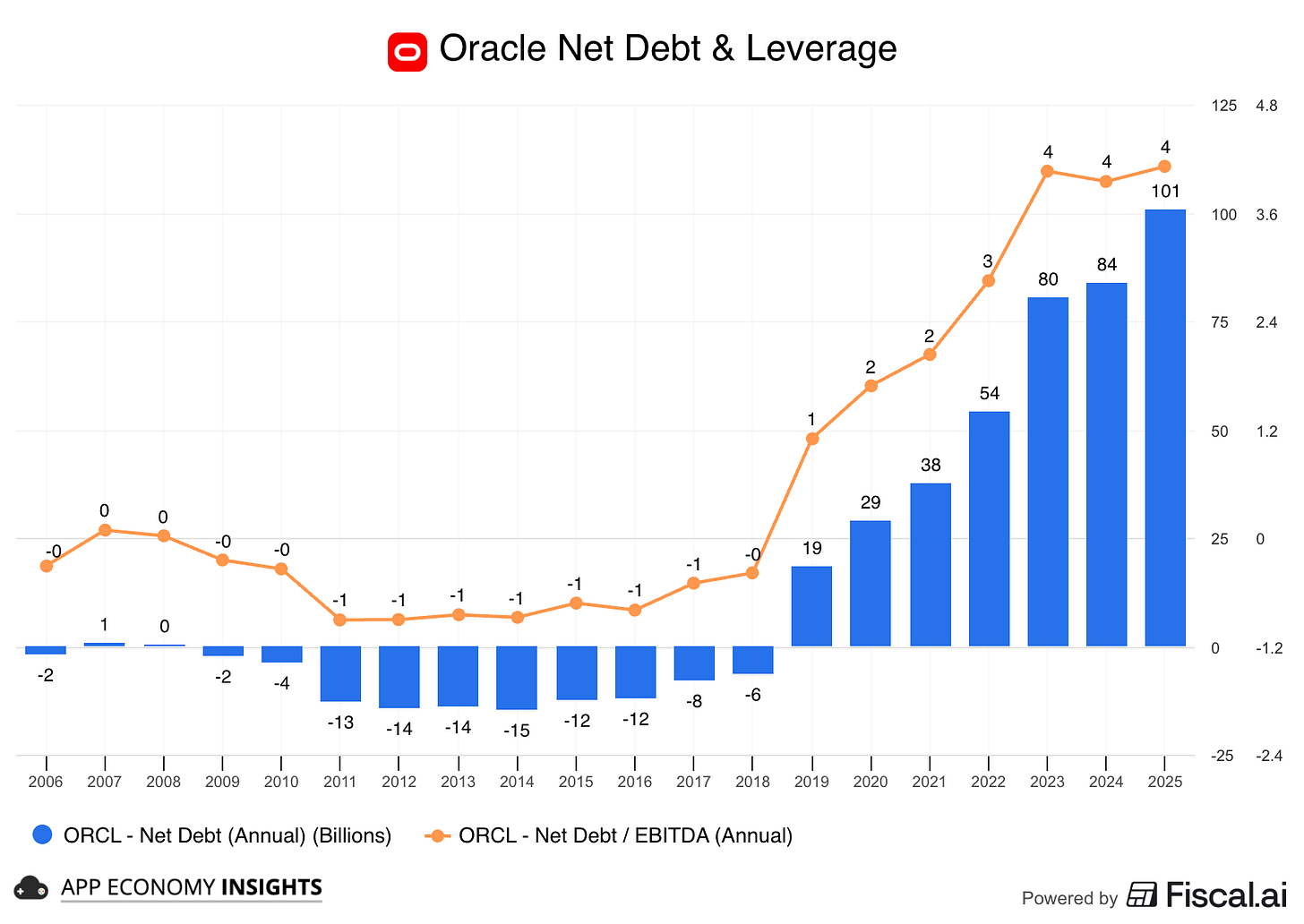
Trend: Oracle has shifted from a net cash position a decade ago to over $100 billion in net debt today (including operating lease), pushing its net leverage to a high of ~4x.
Callout: With leverage this elevated, the focus immediately shifts to the company's deleveraging path. You'd want to see this ratio stepping down and confirm there is no looming debt maturity wall.
Highlight: The true risk emerges when combining 4x leverage with plans for aggressive CapEx spending, which will likely drive free cash flow negative. This creates a precarious profile where resilience depends entirely on management executing perfectly, as discussed in our breakdown of Oracle’s earnings.
4. 🧩 Price vs. fundamentals
This is the reality check. A broken stock is not a broken business. Meanwhile, some stocks surge without the numbers to back it up.
What I look for:
Divergence & duration: Multi-quarter stretches where fundamentals rise while price is flat/down.
North-star metric: I prefer cash flow or operating income over revenue when margins are changing.
Inflections: Margin turn, GAAP profitability, or cash conversion improving.
Cheaper stock, steady business: If the market is paying less for each dollar of revenue/cash flow even as those dollars grow, that's an opportunity.
Indexing sanity: If axes differ, index all data series to a common starting point to avoid scale illusions.
The ideal pattern:
Fundamentals outrunning the stock price for several quarters without a clear deterioration of the business (a general thesis intact, combined with a better entry point).
How I visualize it:
I compare the stock price vs. north-star metrics (revenue, operating income, cash from operations) on the same chart, indexed to 0 at the start of the period, if I need to clearly identify lagging or leading performance.
Example — Salesforce:
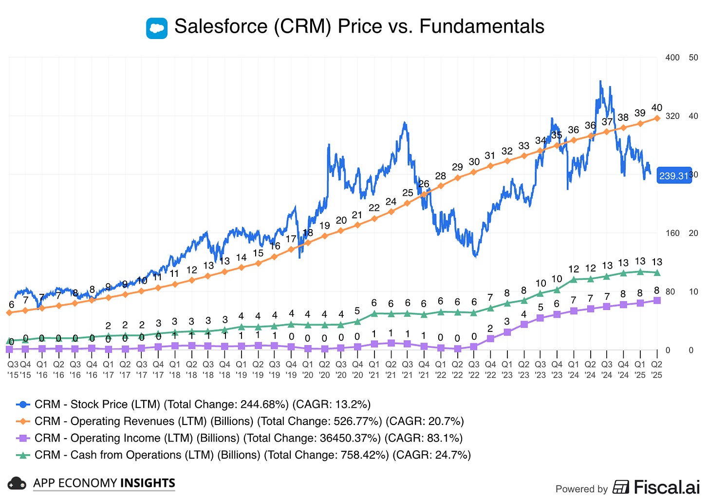
Trend: For years, Salesforce's fundamentals (revenue, profit, cash flow) have climbed steadily, while the share price has been much more volatile, creating clear buying opportunities in hindsight.
Callout: The chart shows the stock became visually detached and overbought relative to its fundamentals in 2021 before correcting and becoming oversold in 2022.
Highlight: This divergence forces a key question. Bull Case: The business is strong, and the stock is undervalued, meaning the gap will close as the stock price catches up. Bear Case: The stock price is a leading indicator, correctly sniffing out a future slowdown that isn't in the numbers yet.
5. 💰 Valuation spectrum
Valuation tells you what's already priced into a stock. The key is to use the right yardstick for the right business.
What I look for:
Enterprise Value > Market Cap: I always use Enterprise Value (EV), which adds debt and subtracts cash from the market cap. This gives a truer picture of a company's total value.
The right metric for the business: There's no one-size-fits-all metric. I pick my yardstick based on the company's profile:
Scaling, low-profit: → EV/Revenue or EV/Gross Profit.
Profitable compounders: → EV/Free Cash Flow (EV/FCF) or EV/EBITDA.
Cyclicals/Semis: → EV/FCF or P/E on normalized numbers over a full cycle.
Banks/Insurers: → Price to Tangible Book (P/TBV) and P/E.
Forward > Trailing: Next 12 months (NTM) multiples and beyond matter most. They reflect future returns. Trailing data can be misleading if the business is rapidly improving or worsening.
Historical context: Where does today’s multiple sit versus its 5–10 year history? Is it in a low, mid, or high band?
Fundamental momentum: Are earnings estimates moving up? A rising multiple is justified if fundamentals are being revised higher. It's a red flag if they are not.
The ideal pattern:
A company with an intact business thesis trading at the low end of its historical valuation spectrum. This is a classic setup for a stock to "re-rate" higher.
How I visualize it:
I chart the forward multiple over time and identify a high/median/low band. This allows for an analysis based on value, not price. As the saying goes, “price is what you pay, value is what you get.”
Example — Meta:
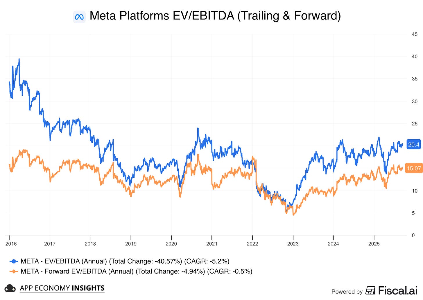
Trend: In 2022, Meta's valuation collapsed to a deep discount versus its history. Since then, as fundamentals improved, the stock has significantly re-rated.
Callout: After that re-rating, the stock is no longer "cheap." At a forward EV/EBITDA of ~15x, it now trades firmly in the middle of its historical range.
Highlight: This means future returns will likely come from business growth (estimate revisions), not from the multiple expansion. The investment case now hinges on ad growth, efficiency, and the payoff from AI spending.
6. 🧭 Peer comparison
Context beats anecdotes. The key here is to compare apples to apples. Same model, same cycle, comparable product mix, and potential. In short, don’t compare Tesla to Ford just because they both sell autos. Careful selection is key.
What I look for:
Apples-to-apples set: Same business model and demand cycle.
Valuation vs. peer group: Is a company getting a valuation premium?
Investigate the "why?": Is the premium backed by faster revenue growth or superior margins?
Convergence risk: If growth/margins eventually converge to peers, the initial valuation premium usually compresses.
Outlier check: Are there mix or accounting quirks (billings, services mix) that skew the comp?
The ideal pattern:
Faster growth and stronger margins than most peers, while the valuation is at or only slightly above the group average. In other words, any premium is earned by the numbers, not just the story.
How I visualize it:
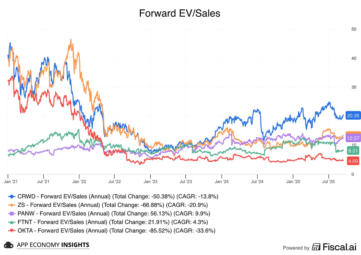
I pick a metric that's most consistent across the peer group and compare it over time. For example, when comparing unprofitable software businesses, I use the forward EV/Sales of the past 3 to 5 years.
Example — CrowdStrike vs. security peers:
Trend: For years, CrowdStrike (CRWD) has consistently traded at a significant valuation premium to its security peers. The chart clearly shows its EV/Sales multiple floating well above the rest of the group.
Callout: This premium is not guaranteed. Following a major IT outage in mid-2024, the chart shows CRWD's valuation rapidly compressing as the market questioned its execution, bringing its multiple metrics much closer to peers like Zscaler (ZS).
Highlight: The key takeaway is that a premium valuation implies a lower margin of safety. While CrowdStrike may have "earned" its premium through superior execution, any stumble can cause a painful slide toward the peer average, posing a significant risk to investors.
That's the 6-point visual scan I never skip. But what did I miss?
If you could add a 7th chart to this checklist, what would it be and why? Share your best idea in the comments!
That's it for today.
Happy investing!
Want to sponsor this newsletter? Get in touch here.
Thanks to Fiscal.ai for being our official data partner. Create your own charts and pull key metrics from 50,000+ companies directly on Fiscal.ai. Save 15% with this link.
Disclosure: I own AMZN, CRWD, META, and NOW in App Economy Portfolio. I share my ratings (BUY, SELL, or HOLD) with App Economy Portfolio members.
Author's Note (Bertrand here 👋🏼): The views and opinions expressed in this newsletter are solely my own and should not be considered financial advice or any other organization's views.


Thank you so much for many wonderful articles.
I would add sector group ranking on top of these. Picking stocks from outperforming sectors increases chances of profitability in short to medium term.